

Specifying decoration placement in a tech pack
A decoration placement is specified the same way a garment measurement is: as a number taken from a named point, on a named size, with the technique and the artwork it belongs to attached. Anything less leaves a decision with whoever opens the file.

Contents
Start with the direct answer. A placement is fully specified when someone who has never spoken to you can produce it: name the artwork, name the technique, give the finished size, give two distances from named landmarks, and say which garment size those distances were measured on. Everything below is detail on those six fields.
This sits inside the wider document described in the tech pack guide, and it assumes the files themselves already meet the artwork file requirements. What follows is only the placement block.
The fields a placement needs
| Field | Why it is there |
|---|---|
| Artwork reference | Ties the position to a specific file. Without it, a revised logo can be applied to an old placement or the reverse. |
| Technique | The same position is not achievable by every method, and the setup cost differs. It also determines which proof you will be approving. |
| Finished width, and height where the shape demands it | Width alone describes a wordmark adequately and describes a tall lockup badly. |
| Vertical origin and distance | Normally from the high point of the shoulder, or from the neckband seam where that is the clearer landmark. |
| Horizontal origin and distance | From centre front, from a placket edge, or from a seam. Say which, and say whether the distance is to the artwork's centre or to its nearest edge. |
| Reference size | The garment size the measurements were taken on. A placement chart without one cannot be graded or checked. |
| Scaling rule | Fixed, position-adjusted or scaled across the size range. Stating nothing is choosing the first by default. |
| Colour reference | Spot colour, process build or thread shade, depending on the technique. |
| Orientation | Only needed where it could be ambiguous: sleeve marks, hem marks and anything on a curved or angled panel. |
| Approval reference | Which strike-off, sew-out or sample the placement was approved on, so bulk has something physical to match. |
Choosing the landmarks
Measurements are only reproducible if their origins are. A garment landmark qualifies if it is unambiguous, if it exists on every size, and if it does not move when the garment is laid flat differently.
The two distances
The two distances a placement needs, plus the finished artwork width. Which landmark each is measured from has to be named, because the choice differs by garment.
| Landmark | Use it for | Watch for |
|---|---|---|
| High point of shoulder | The usual vertical origin on tops | It has to be identified consistently; on a raglan or a dropped shoulder the shoulder point is not where an inexperienced eye expects |
| Centre front | The horizontal origin on garments with no front opening | On a folded garment the fold is the centre front, so say whether you measured to the artwork's edge or its centre |
| Neckband seam | Vertical origin for nape and upper back marks | Clearer than the shoulder point for anything sitting close to the neck |
| Placket edge | Horizontal origin on polos and button-through shirts | The placket is the visual centre a viewer reads, so measuring from it keeps the logo looking right |
| Shoulder seam or armhole seam | Sleeve placements | Say which of the two, and whether the distance runs down the sleeve centre |
| Hem or cuff edge | Marks placed near the bottom of a garment or sleeve | Hem depth varies between styles, so this only works where the hem is itself specified |
Avoid measuring from anything that is itself a variable. A distance from the bottom hem drifts as the body length grades, and a distance from a pocket is only stable if the pocket placement is stable, which makes it a second-order reference rather than an origin.
A weak instruction and a usable one
These are constructed examples rather than customer documents, and the numbers in them are illustrative.
Left chest logo on a polo
What often arrives
- "Logo on left chest"
- "Embroidered, normal size"
- Logo file attached, named logo-final-v3.png
- "Colours as per our brand guidelines"
What can be produced
- Artwork: LOGO-01, vector file supplied separately
- Technique: embroidery
- Finished width 80 mm, height follows the artwork
- Vertical: 200 mm from the high point of shoulder to the top of the artwork
- Horizontal: 40 mm from the placket edge to the nearest edge of the artwork
- Reference size: M. Fixed size and fixed position across S to XXL
- Thread shades to be proposed against the brand references and approved on the sew-out
The second version is not longer because it is bureaucratic. Every extra line removes a decision that would otherwise be made by someone who has not seen the brand, and each of those decisions is a place where a reorder can differ from the original.
One further point on the file name. A raster file called logo-final-v3 tells a factory nothing about which version is current, and a mock-up of the logo sitting on a garment is not an artwork file. Give the artwork a reference that the placement row can point at.
Handling the size range
The scaling rule is one line and it has three possible values, described in full on the artwork placement hub. In a tech pack the practical question is how to express it without writing out every size.
- State the artwork size and both distances for the reference size.
- State the rule: fixed across all sizes, position adjusted per size, or artwork scaled in named size bands.
- Where the position is adjusted or the artwork scales, give the values for each band rather than a formula, because a formula gets applied differently by different people.
- Where the range spans men's and women's blocks, treat them as separate rows. The vertical drop that suits one rarely suits the other.
Two or three bands cover many programmes. Continuous scaling across every size means a separate screen, a separate embroidery file or a separate panel layout for each one, and the cost of that is rarely justified by what the customer sees.
More than one decoration on a garment
Each placement gets its own row. That sounds obvious and it is where specifications often go thin: the chest logo is described carefully and the sleeve badge, the nape print and the hem label are covered by a sentence.
Placements that get forgotten
- Sleeve marks, including which sleeve and how far from which seam
- Nape or back neck prints replacing a woven label
- Care and content labels, which are a placement as well as a compliance item
- Hem tabs and woven labels caught into a seam
- Hood and drawcord marks
- Anything on the inside of the garment, where access during production is the constraint
Labels in particular need to be treated as placements rather than as materials. Where they go is a construction decision, because a label caught into a seam has to be positioned before that seam is sewn. The labelling requirements themselves are covered in labels and packaging.
Placement sheets for merch drops and promotional runs
A merch drop or a promotional run puts the same artwork on several styles, and each style still needs its own placement sheet. A tee, a hoodie and a crewneck share a logo but not their landmarks: on the hoodie the kangaroo pocket limits how low a chest print can sit, and the hood seam changes where a back print starts. Each sheet gives every position in mm from a named point, the artwork file per size band (for example S-M, L-XL, XXL-3XL), and the decoration method per position, since a front print and a sleeve embroidery on the same garment are two processes with two sign-offs.
Colour references go on the sheet per garment colour. A drop in black, white and heather grey often changes the ink or thread colour per body, stated as a Pantone or thread-card reference. For a promotional distributor, having the end client approve the sheets before sampling reduces the risk of a second sample round. Programme detail is on the custom merch and promotional textiles pages.
What to attach alongside the table
A drawing carries information a table cannot, and it removes the mirroring errors that written left and right instructions produce. It does not have to be elaborate.
- A front and back flat drawing with each placement marked and referenced to its row
- Arrows showing which distance is which, so nobody has to infer whether a measurement runs to the artwork's edge or its centre
- The artwork files themselves, at production size where the format allows it
- A note of any placement you already know is tight, so it is checked at sampling rather than in bulk
Send the drawing with the specification rather than instead of it. The drawing shows intent; the table is what the operator works to and what an inspector measures against.
Locking it after approval
Once a placement has been approved on a physical sample, the approved sample becomes the reference and the specification should be updated to match what was actually made. If the sew-out came back at 78 mm rather than 80 mm and was approved, the specification says 78 mm from then on.
That discipline is what makes a reorder reproducible a year later with a different production team, and it is the same argument made in reorder consistency. A specification that no longer describes the approved sample is worse than no specification, because two references now disagree.
Decorated references
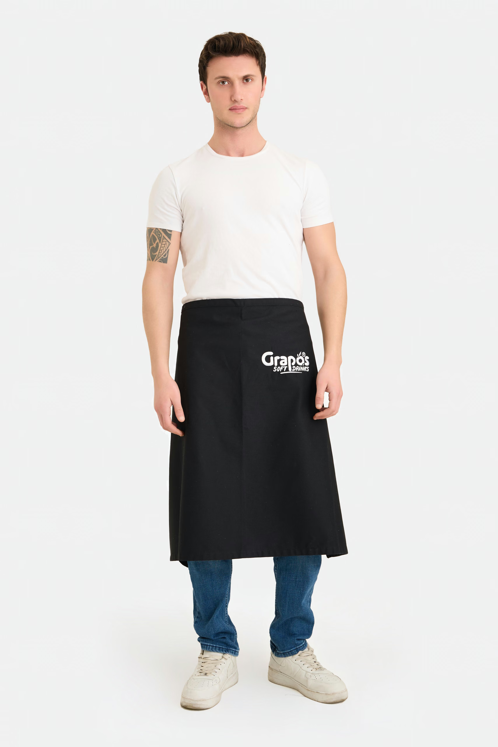
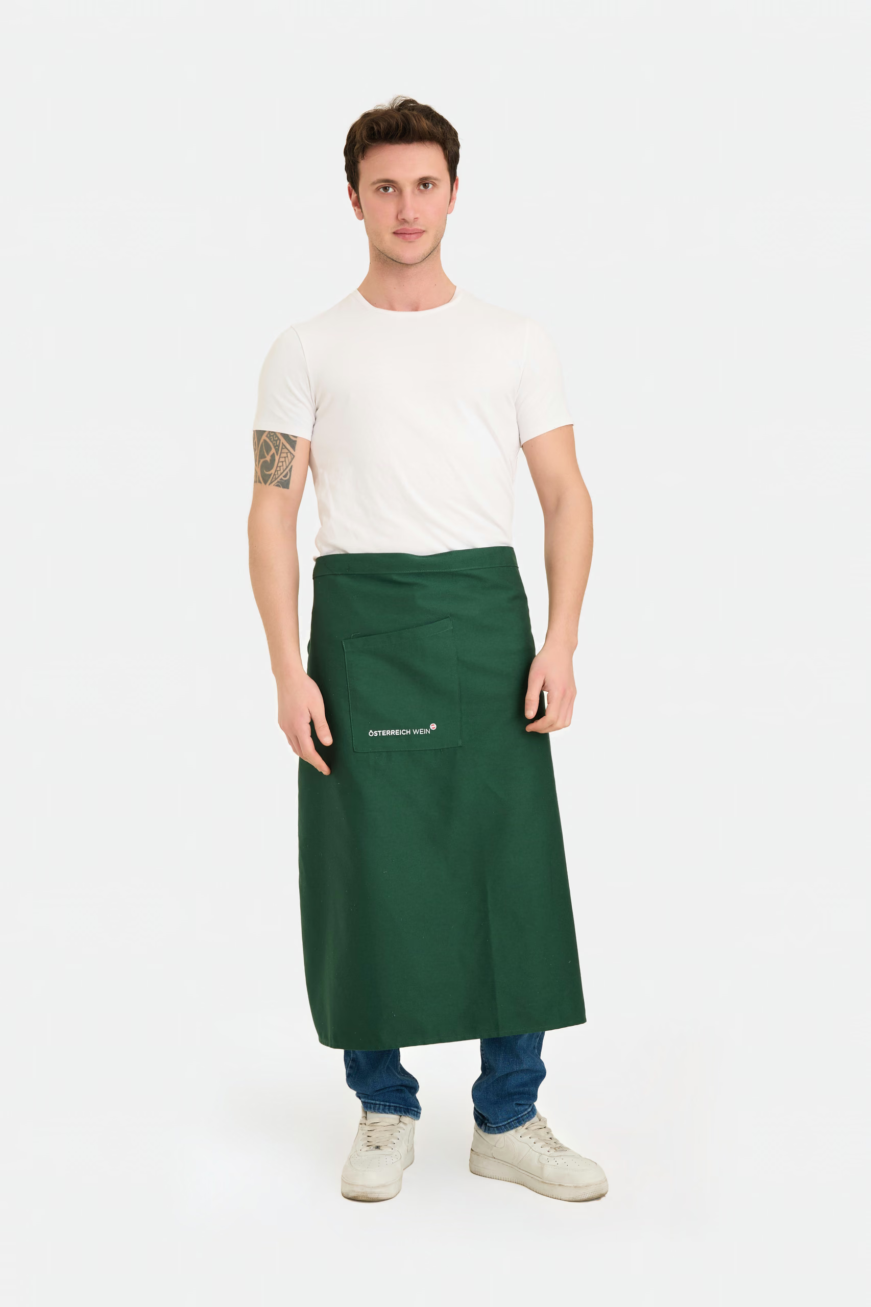
Previously produced customer references carrying chest logos, prints and embroidery.
Questions this raises
How do I specify print placement in a tech pack?
Give the artwork reference, the technique, the finished size, a vertical distance from a named landmark such as the high point of the shoulder, a horizontal distance from centre front or a placket edge, and the garment size those measurements were taken on. Add the scaling rule for the rest of the range. Attach a flat drawing showing the same information visually.
Should I measure to the edge of the artwork or its centre?
Either works as long as you say which. Measuring to the nearest edge is usually easier to check with a ruler on a finished garment, and measuring to the centre suits symmetrical marks. What causes problems is leaving it unstated, because the two conventions can differ by half the artwork's width.
Do I need to give a placement for the care label too?
Yes. A label is a placement as much as a print is, and one caught into a seam has to be positioned before that seam is sewn. Labels are often omitted from a placement table.
What should I do if the factory changes the placement slightly at sampling?
If you approve the sample, update the specification to the value that was actually made. Leaving the original number in the document means the approved sample and the specification disagree, and a later production team has no way of knowing which one to follow.
We will tell you what is missing
Send the specification you have. We review placement and artwork for feasibility before quoting, and flag the rows that are not yet answerable rather than guessing at them.
Request a quotation