Production reference
Apparel artwork placement: sizing, positioning and specifying decoration
A logo file is half an instruction. The other half is where it sits, how large it is, what it is measured from, and whether any of that changes between a small and an extra large. Those are the decisions that make a decorated garment reproducible, and they are often left to somebody else.
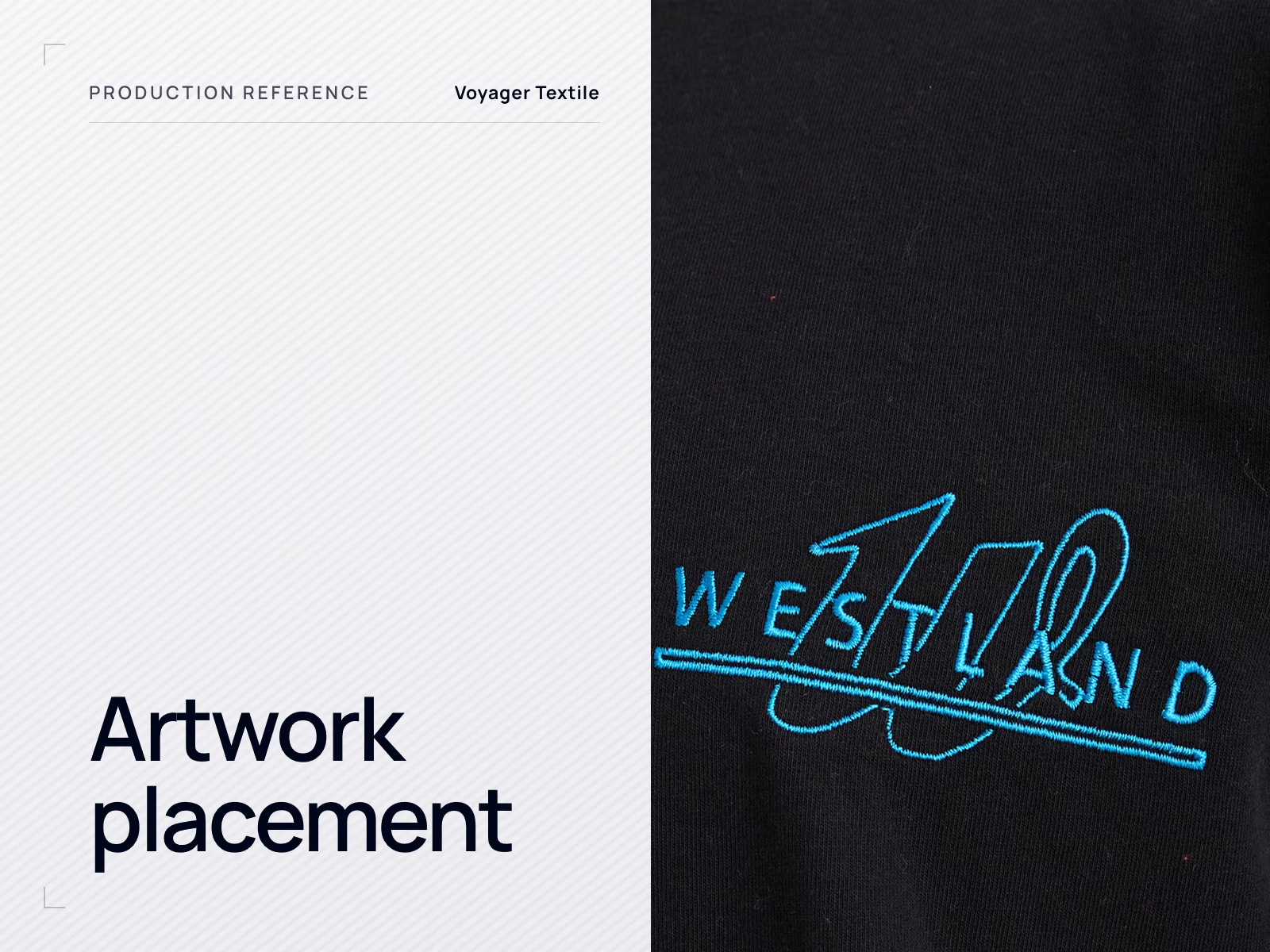
This section is about position and size, not about technique. Which decoration method suits a product is covered in the printing and embroidery comparison, and what files a factory needs is covered in artwork file requirements. What follows assumes those two decisions are made and asks the next question: exactly where does the artwork go, and how do you write that down so the thousandth garment matches the first.
It matters more than it sounds. A logo two centimetres lower than intended is not a defect anyone can point to in a specification that never stated the position, and by the time it is noticed the order is packed.
The vocabulary production actually uses
Placement positions have ordinary names, and using them is better than inventing anything more descriptive. A factory hears left chest and knows the region being described. It does not know what an upper torso branding zone is.
Front placement zones
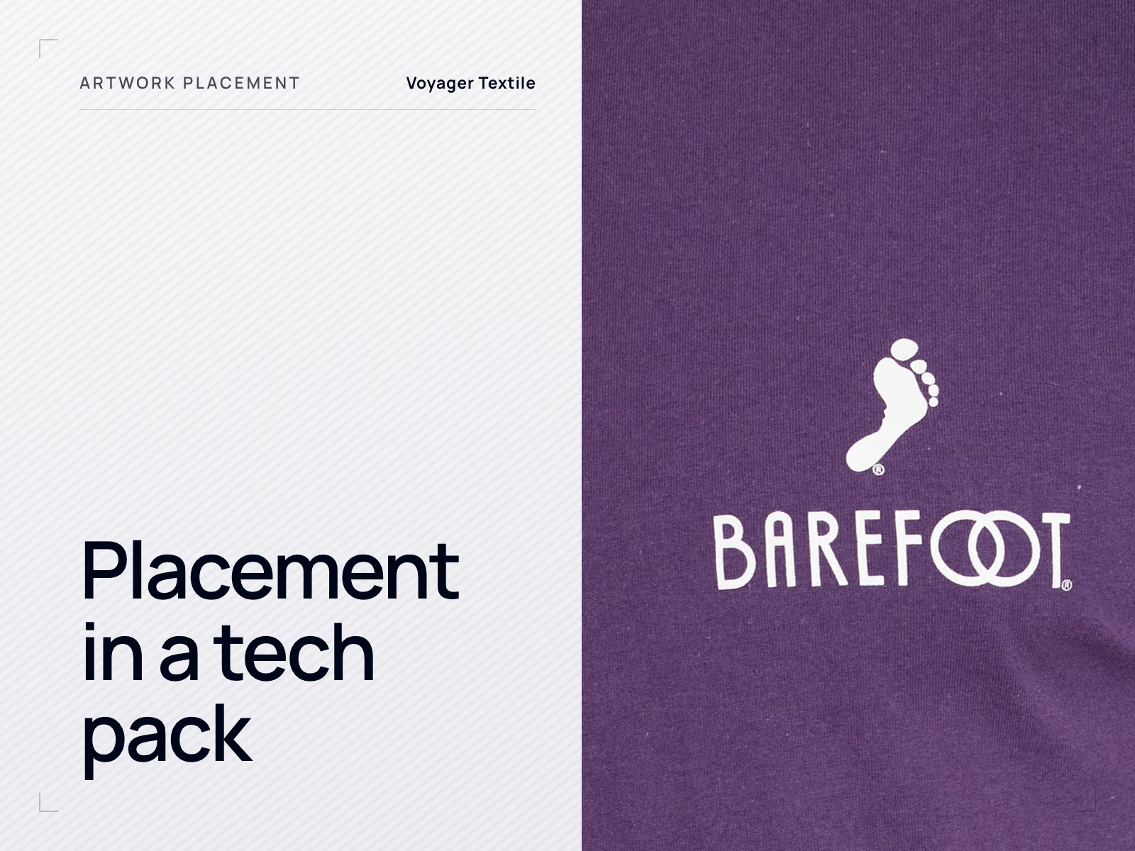
Named regions on the front of a garment. Left chest means the wearer's left, so it appears on the right as you look at the garment. These describe an area, not a specification: the position within each region still has to be measured.
Back placement zones
The back divides differently. A nape print takes the place of a woven label, and an upper back print sits below the neckband seam.
| Term | Where it is |
|---|---|
| Left chest | The wearer's left chest, so it appears on the right as you look at the garment. The standard position for a corporate logo. |
| Right chest | The mirror position, used where the left chest is occupied or where two marks are wanted. |
| Centre chest | Centred on the front, roughly at chest height. Common for a wordmark that is too wide for a chest position. |
| Full front | A large front graphic, typically starting below the neckband and running down the body. |
| Nape, or back neck | A small mark just below the back neckband, often replacing a woven label. |
| Upper back | Across the shoulder blades, below the neckband seam. |
| Full back | A large back graphic. On sportswear this is where a number goes. |
| Sleeve | On the upper arm or the forearm; the position has to say which, and how far from the shoulder or the cuff. |
| Hem, cuff, collar, placket | Small marks on a trim or an edge, constrained by whatever the trim is. |
Why "logo on left chest" is not enough
Left chest names a region roughly the size of a hand. Two garments with the logo anywhere inside that region are both correct against that instruction, and they look noticeably different side by side. The instruction is also silent on how big the logo is, which is the more consequential of the two.
A placement becomes reproducible when it is expressed as measurements from points that do not move. The garment's own landmarks are the stable references available: the high point of the shoulder, the centre front, a seam, a placket edge, a pocket edge, the hem.
Measuring a placement
Centre front and the high point of the shoulder are the two usual stable origins on tops. The drawing shows which distances to state; it does not state values, because no value here is universal.
The same placement, two ways
Weak
- "Logo on left chest"
- "Standard size"
- "Same as last time"
- "Roughly where the pocket would be"
Usable
- Artwork reference, so the file and the position cannot be separated
- Technique, because the same position is not achievable by every method
- Finished width, and height where the shape makes height the limit
- Vertical distance from the high point of the shoulder to the top of the artwork
- Horizontal distance from centre front, or from the placket edge, to the nearest edge of the artwork
- The garment size the measurements refer to
That list is the placement block of a tech pack. How to write it, and what to do about the fields that are easy to forget, is covered in specifying decoration placement in a tech pack.
How large should a chest logo be?
There is no universal answer, and any source that gives one is describing a convention rather than a rule. Published placement guides from decoration suppliers commonly suggest a left chest mark somewhere in the region of 7 to 10 cm wide, positioned in the order of 18 to 23 cm down from the shoulder seam on adult menswear, with women's garments taking a shorter drop. Those figures vary between sources, which tells you what they are: starting points that a real product then adjusts.
The reason they vary is that width alone does not describe a logo. A wide, short wordmark and a compact circular crest at the same width are visually very different marks, and they sit differently on the chest.
| Artwork shape | What limits it | What to state |
|---|---|---|
| Wide wordmark | Width, since it can run out of chest before it runs out of height | Finished width; height follows |
| Square or circular crest | Height as much as width, and legibility of any inner detail | Finished width and height |
| Tall or stacked lockup | Height, since it can drop towards the underarm | Finished height; width follows |
| Fine lettering inside a mark | The smallest legible element rather than the overall size | Overall size plus the minimum acceptable text height |
The practical route is to fix the size on a physical sample at the base size, then record the number. A logo judged on screen at 100% is often chosen slightly too large.
What the garment will not let you do
Placement is constrained by construction long before it is constrained by taste. A position that works on a plain jersey panel may be impossible fifty millimetres away because a seam, a pocket or a zip is in the way.
| Feature | What it does to decoration |
|---|---|
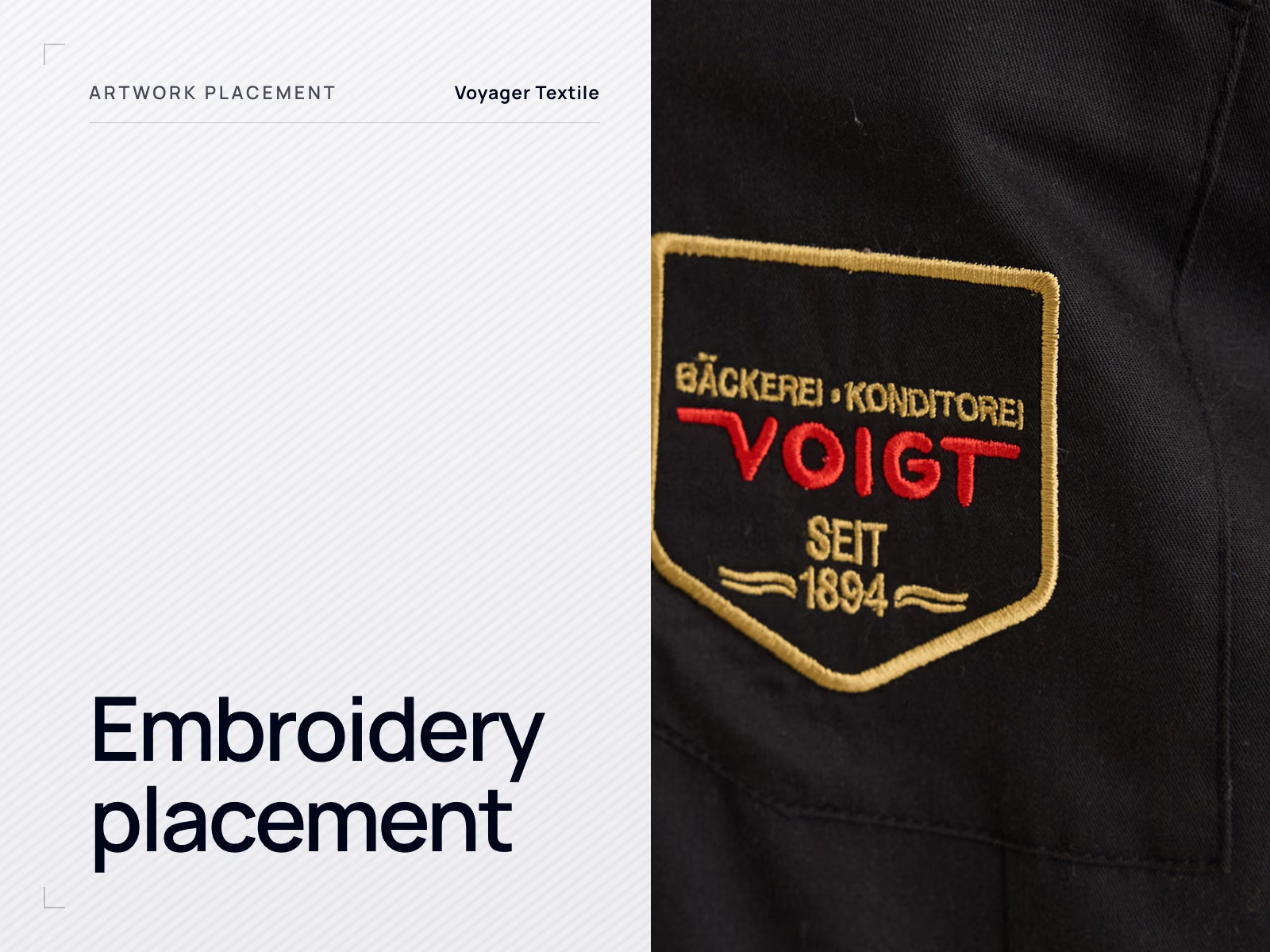
| Seams | A print crossing a seam has to bridge a step in thickness, and the two sides can shift relative to each other. Embroidery across a seam is harder still, because the seam allowance sits under the needle. |
| Plackets | The placket is stiffer than the panel beside it and often interlined, so artwork crossing it distorts. On a polo the placket also becomes the horizontal reference for the chest position. |
| Pockets | A pocket is a second layer with its own edges. Decoration can go on the pocket or clear of it, but placing artwork so it runs off the pocket edge rarely works. |
| Zips | A zip cannot be printed across, and embroidery near one is limited by whether the area can be presented to the machine flat. |
| Rib trims | Rib stretches and recovers, so artwork applied to it distorts in wear and can crack. |
| Linings and internal layers | Decoration is applied before a lining closes the garment, so the sequence has to allow access at the moment the artwork goes on. |
The garment construction reference sets out what each of those components is and why it behaves that way. The point here is narrower: a placement has to be checked against the construction before it is approved, not after.
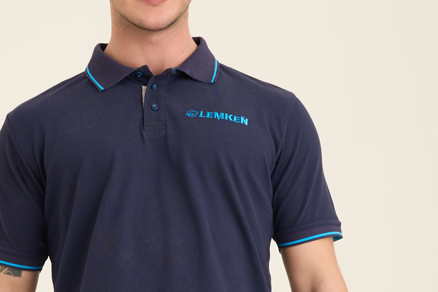
A left chest position on a polo has two constraints at once: it has to clear the placket on one side and stay well inside the armhole on the other. The wordmark's width, not its height, is what the available space limits.
Fabric changes what is achievable
The surface matters as much as the shape underneath it. The same artwork behaves differently on smooth jersey, on textured piqué, on brushed fleece and on a technical polyester.
- Smooth flat knits such as single jersey hold fine print detail well and impose few constraints.
- Textured structures such as piqué break up fine lines, which sets a practical floor on small lettering.
- Brushed and pile surfaces such as fleece have a nap that thin embroidery can sink into and that print sits on unevenly.
- Stretch fabrics move under the artwork, so anything applied to them has to tolerate extension or it cracks.
- Polyester performance knits are the surface that all-over sublimation depends on, and they carry their own colour behaviour.
None of this rules a technique out on its own. It changes what size and level of detail are sensible, which is a specification decision rather than a production one.
Does the artwork change between sizes?
It is a real decision with three legitimate answers, and leaving it unstated means the factory picks one. The common default in production is the first.
| Approach | What happens | When it suits |
|---|---|---|
| Fixed size, fixed position | The same artwork dimensions and the same measurements on every size | Small marks such as a left chest logo, where the difference is imperceptible and one screen or one embroidery file covers the range |
| Fixed size, adjusted position | The artwork stays the same; the measurements shift so it stays visually centred as the garment grows | Chest and back marks across a wide size range, and any range spanning men's and women's blocks |
| Scaled artwork | The artwork grows and shrinks with the garment | Large graphics, full front and full back prints, where a fixed size looks lost on an extra large and crowded on a small |
Scaling is not free. Screen printing needs a separate screen for each artwork size, embroidery needs the design re-digitised rather than simply enlarged, and sublimation needs the artwork re-laid onto each panel set. That cost is why many programmes scale in two or three size bands rather than continuously, and why small marks are usually left fixed.
Colour, across four different processes
A colour reference communicates intent; it does not guarantee a result. A Pantone number, a CMYK build, an RGB value and a thread shade are four different things, and a logo reproduced by screen print, sublimation, transfer and embroidery will not match itself exactly across all four. Ink on a fabric surface, dye inside a polyester fibre and a dyed thread are physically different materials.
- Spot colour references work for screen printing, where an ink is mixed to a target.
- Sublimation and other digital processes work from a colour profile through a printer's own colour management, so the same reference is an input to a conversion rather than a specification of the output.
- Embroidery uses thread shade numbers from a thread manufacturer's range; the nearest thread to a brand colour is chosen, not mixed.
- The garment colour underneath changes the result on anything that is not fully opaque.
The workable approach is the one described in Pantone colour matching: give the reference, then approve the physical result of each process separately. Where a brand mark appears in more than one technique across a range, approve them together so the difference between them is a decision rather than a discovery.
Getting artwork approved
Every technique has an approval artefact, and they are not the same artefact. What they share is that the check happens on the real fabric, in the real colour, at the real size.
From artwork to a locked production file
| Technique | Approval artefact | What it proves |
|---|---|---|
| Screen printing | Strike-off on the production fabric | Colour, opacity, hand feel, registration |
| Embroidery | Sew-out on the production fabric | Density, legibility of small detail, distortion, backing choice |
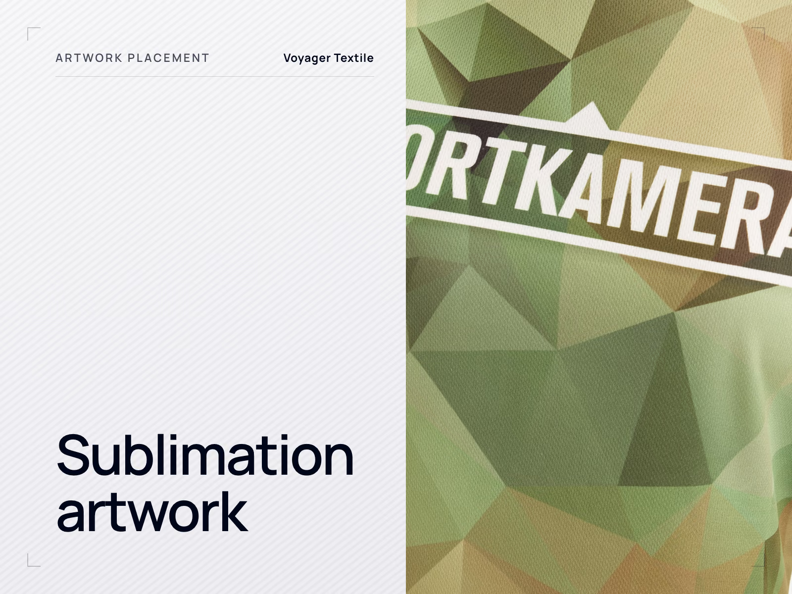
| Sublimation | Printed panel or a full garment sample | Colour after fixation, panel alignment, artwork continuity across seams |
| Heat transfer | Applied and washed sample | Adhesion, edge quality, hand feel, wash durability |
A proof approved on paper or on a different fabric proves very little, which is the same argument the pre-production sample makes about the garment as a whole.
Placement tolerance
A specification states a target position. Production works to that target within an agreed tolerance, because garments are handled by people and fabric moves. Those are two different numbers and both belong in the agreement.
There is no universal placement tolerance in apparel. What is achievable depends on the garment, the technique, the fabric and the position, and a tolerance that is realistic on a flat jersey panel is not realistic on a stretch rib or across a seam. Agree it per project, in writing, at the same time as the measurement tolerances, and be aware that asking for a tighter tolerance than the process supports produces rejected garments rather than better ones.
The general principle, and how tolerances are inspected against, is covered in apparel quality control.
Where Voyager fits
We review incoming artwork and placement for feasibility before quoting, and say where a position or a size will not work on the garment in question rather than producing it and letting the sample explain. Embroidery, transfer and sublimation printing are handled in-house, and specialist techniques run with established partners. Placement is confirmed on a physical sample before bulk and held on file for reorders.
Buyer questions
How large should a left chest logo be?
There is no universal size. Published placement guides from decoration suppliers commonly suggest something in the region of 7 to 10 cm wide for an adult garment, but the figures differ between sources and the right answer depends on the artwork's shape, the garment and the technique. Fix it on a physical sample at the base size and then record the number, because a logo judged on screen is usually chosen slightly too large.
Should a logo be the same size on a small and an extra large?
For a small mark such as a left chest logo, usually yes: the difference is imperceptible and one screen or one embroidery file covers the range. For large front or back graphics, usually no, because a fixed size looks lost on an extra large. A middle option is to keep the artwork size and shift the measurements so it stays visually centred. Whichever you choose, it has to be stated, or the factory decides for you.
Can decoration cross a seam?
Sometimes, and it costs something. A print crossing a seam has to bridge a change in thickness and the two sides can shift relative to each other. Embroidery across a seam is harder, because the seam allowance sits under the needle. Artwork designed to continue across a seam in sublimation is a different case, because there the artwork is printed before the panels are joined and is drawn to match at both edges.
What is the difference between placement and artwork size?
Placement is where the artwork sits, expressed as distances from stable garment landmarks. Artwork size is how large it is, expressed as a finished width and, where the shape demands it, a height. A specification needs both: either one on its own leaves the result open.
Send the placement with the artwork
If your files come with positions and sizes we can quote and sample against them directly. If they do not, tell us what the product is and we will propose a placement for you to approve before anything is made.
Start a project